Introduction

Welcome to my A2 media Blog, I'm Josh Stevenson (0796) and I'm in Group 2 with Harry Kettenis (0390), Matthew Romo (1660) and Ysabel Hudson-Searle (0331). Use the labels on the right to navigate through my blog, with the A2 labels relevant to my current course. You can access the main music video blog aswell using the link.

Here is the live link to Group 2's Facebook Page.

Thanks.

Music Video

Our Music Video

Digipak


Our Digipak
Top Left: Back Cover, Top Right: Front Cover
Bottom Left: Inside Back, Bottom Right: Inside Front

Our Website


Our Website (Click to Enter)
Showing posts with label A2 Construction. Show all posts

Wednesday, 10 December 2014

Editing Publicity Shots

Matt and Yssy were predominantly the main editors for the promotional shots, with Harry and I chipping in every now and again when there were specific shots that we needed, that hadn't yet been edited. Adobe Photoshop ended out being a god send for our group, because some of us aren't the most confident in using the software; but everyone was given a chance to get to grips with editing images on its simple and easy to use interface.

One of the re-occurring issues we encountered when editing the shots, was Yssy's curly hair. Since the background for many of the original shots wasn't pure white, we needed to crop Yssy out of the shot and place her image onto a plain white background. However, because her hair is so curly and naturally spreads itself out and the very light colours in the tips of her hair, it was difficult to do so.

Quick selection tool


Our first step was to use the "quick selection" tool to highlight all of Yssy and separate her from the off-white background. This wasn't easy because of her hair, as Photoshop continually missed out the lighter parts of her hair, because it couldn't separate the colour of them and the background. 


Refine edge


To make sure that Yssy didn't look like we cut off a chunk of her hair with scissors when we place her onto a white background, we used the "refine edge" tool. This allowed us to increase the contrast in tones in the end of her hair and differentiate her hair from the background and fade out where the image crops the hair, to give it a natural point where it ends.

Before (Left), After(Right)


Once we had managed to give the crop of the image a neat finish, we placed her in front of a plain white background. This then gave us a blank template which we were then able to make adjustments to various elements of the images, such as colour, brightness and contrast.


Brightness and Contrast


In a lot of our original promo shots Yssy blends into the background way too much for our liking, because of our lighting on the day of the shoot. To bring her into the forefront, we adjusted the contrast and lighting to levels we were happy with.


Colouring


The next step for us was to address the unnatural skin tone this gave Yssy, which was very simple to rectify. Adjusting the colouring of the shot to give Yssy a warmer complexion rather than the grey tones wasn't a challenge.


Spot heal tool


In some of the tighter shots where Yssy's face is much more visible, we used the "spot heal" tool to blend any blemishes present into the face and make them less visible. We also used a preset known as "skin smoother" to iron out any discolouration to the skin and give it a much smoother look.
Adjusting rose


With some of our shots, there were specific elements which we weren't happy with. In this image for example, we wanted the rose to stand out more in the shot and have a much more intense colour. This was easily done, using the "quick selection" tool to highlight the rose and the adjusting the colouring of
the selected rose.

Grading

After finalising the order of our shots and seeing the resulting product, we're happy with the progression of the music video. We then moved onto grading the shots in our music video. Below is an overview of the grading throughout the entire video. The left hand side has the grading, while the right hand side is ungraded to show a before vs. after comparison.


Grading for "Wet performance" shot:


Graded (left), Ungraded (right)
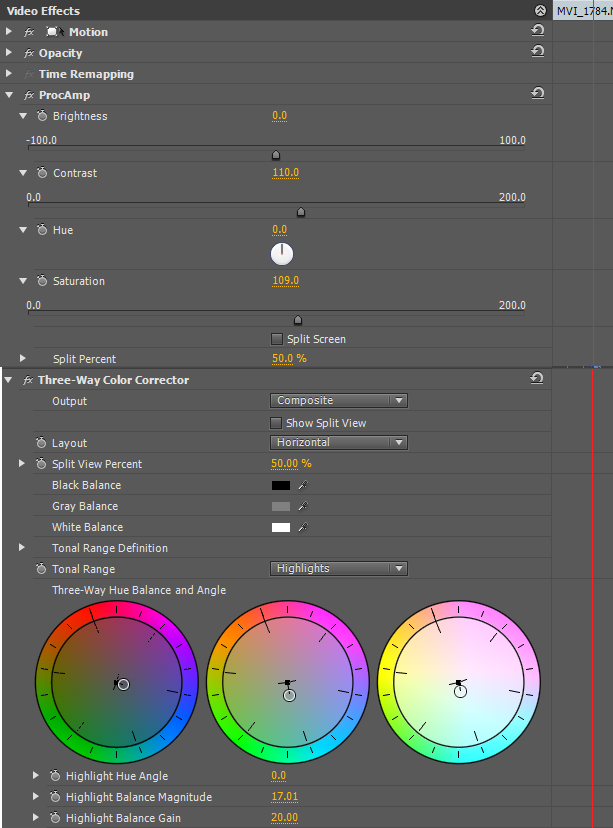
Something which we noticed when grading this shot, is that the colours are quite dull, making Yssy look grey and lifeless. It was simple to rectify this, increasing both brightness and contrast and using three-way colour corrector to restore the colour to Yssy's skin and hair. The overall look is one that is very much stripped back, showing Roza in her most vulnerable state.
                     
ProCamp & Colour Corrector                                


Grading for "Fire performance" shot:


Graded (left), Ungraded (right)

The Fire performance shots are meant to smack the audience right in the face, showing Roza as she fights back against the emotions and frees herself from the chains of relationships.

Our footage has the vibrant colours we want, but it is extremely dark, this mainly being due to the constraints of us opting to use a projector to light the shot. The issue we faced, was trying to maintain the colouring of the shot. while increasing the brightness. However, every time we increased the brightness to a level we were happy with, the shot would get whited out to a great extent. We managed to find a medium between the two using Luma corrector, ProCamp and Three-way Colour corrector that we were all happy with, that looks very good.

ProCamp, Luma Corrector & Colour Corrector


Graded (left), Ungraded (right)
The grading for the close-ups were that much more difficult because of how close Yssy had to be to the projector, meaning that these shots were much brighter than other compositions. The main issue, is that by decreasing the brightness you lose the intensity of the flames; which dampens the meaning behind the shot.

To counteract this, you can see what we used Luma corrector, as can be seen below:


Luma Corrector

Grading "Silhouette Performance" shots:

Graded (left), Ungraded (right)

The best way for us to grade these shots, was to use Color Finesse on adobe after effects, because of the variation of shades of black, white and grey. Color Finesse allowed us to be precise in our editing of the colours and make slight. but noticeable adjustments:


Color Finesse

Grading for "Rose performance" shots:

Graded (left), Ungraded (right)


Graded (left), Ungraded (right)
Very little needed to be done to this footage, with the only element us not being totally pleased with is the colouring to Yssy's skin and jacket. They are much brighter than what we wanted. The rose performance shots are much more aggressive than the other performance shot; so while we don't the shots to look totally dead, we also do not want the colours to convey a cheery and joyful atmosphere.


Turning the brightness down was the first obvious step, while then adjusting the saturation to counteract the inevitable graying of  of Yssy's skin tone. After this, we were all happy with the colouring of the footage and decided to leave it there.

           
ProCamp        


Grading for Narrative shots:


Graded (left), Ungraded (right)


Graded (left), Ungraded (right)


For the Narrative shots in the house, near enough no grading was needed. We wanted the shots to look as natural as possible and the best way to do that is to leave the footage as is in terms of colouring; there were no major flaws in the footage that we absolutely had to fix, so we left the footage as is. 

We wanted it to be clear to audiences that the narrative shots are memories, without losing the natural tones of the footage. We thought that the best way to do this, would be to put a vignette over the clip, which gives that slightly faded effect over and around it.


Adding Vignettes to footage


Graded (left), Ungraded (right)

The narrative shots in Trafalgar square required us to take the footage into Adobe After Effects in order to remove the vast majority of the grain.

Removing grain in After Effects

Other than that and placing a vignette over the clip to show it is a memory, only slight colour correction was needed because of where the footage was shot.
ProCamp & Colour Corrector

Grading for Club Shots:


Graded (left), Ungraded (right)
Although very slight, we did make some adjustments to the colouring of these shots. Mainly using Procamp to make the shot less blue and more purple-ish to give it the look of club lighting, rather than it just being dark.
                               
ProCamp & Colour Corrector                                        


Grading for Dance shot:


Graded (left), Ungraded (right)


We only used Procamp when grading the dance shots, because from the start we decided that these clips would be in black and white to work in tandem with the Wet performance shots.

We quite liked the idea of trying to keep in some of the dancer's features, to make her seem like a person, rather than just a dancing figure. The fact that the dancer is a female gives the impression that it's a reflection of Roza, which is why we wanted to keep some life in the shot.

We turned the saturation down almost as far as we could; while increasing the brightness to make the background completely blank and increased the contrast high enough, so that the glint from the light hitting her skin is still present.

ProCamp


Grading for Other Concept shots:


Graded (left), Ungraded (right)
This show was simple to grade, using the "black and white" preset in Premiere Pro to remove the colour from the shot. Having the shot in black and white was a decision made as a group to objectify person as a canvas to show the progression of Roza's relationship.


The next 2 shots were left ungraded, as we were all extremely happy with the look of the footage. We were pleased with the effects the lighting used in the shoot gave and felt that adjusting the colours or look of the shots would in fact detract from them.
Drumming Shot
Hair flick Shot


Website Progression - Interactivity

The whole idea of a website is to get audiences interested in the artist and give them a chance to feel that much closer to the ban if they do, in turn, become fans. In order to do this, we aimed to make our website as interactive as possible; giving fans as many opportunities to get involved with Roza as possible.


When audiences open the website they are given the latest news that Roza is releasing her debut album. Once they're aware of the album, they can then enter the site and find out more about Roza as an artist.
Encouragement to go to main site

Second opportunity to pre-order album


When they reach the website's homepage, they are then again reminded that they can pre-order Roza's album with the same countdown as on the landing page.


Link to Instagram and Twitter
 attached to footer
Encouraging audience to follow
on Twitter and engage
The web page for us, acts as a hub where all of Roza's social media comes together. Because of this, there are multiple links, live feeds and chances for audiences to get involved with Roza's social media pages by sharing them with friends.
Live feed to Twitter


The live feed, which links to Roza's Twitter account is constantly being updated directly by Roza. Meaning that fan can stay on the website an still get all real time updates from Roza.


There are also scrolling advertisements on the homepage, showing audiences the highlights of the web; with each ad linking to the corresponding page on the website. Encouraging audiences to have a look around the website and get involved. The meet Roza ad, for example, linking directly to the competitions page.

Advert Scroller
Also in the footer of the website is a subscription box, where audiences can sign up to receive a weekly newsletter with exclusive news and updates about Roza that only those who sign up will know.
Subscription bar
The competition


By participating in our competition, audiences are not only connecting with the music as it requires them to pre-order the album, they are also interacting with the artist on social media, by submitting their entries via the twitter page.


Contact Page


Audiences also have the option of sending messages directly to Roza without having to leave the website, through use of the Contact page. They can write a message to Roza, leave their contact details and receive a personalised response , building another connection between audience and artist.


Everything is portable nowadays, so we wanted to make the transition from pc to portable as easy as possible, which is why we placed a qr code on the website. This enables audiences to scan the code and move the website onto their mobile or portable device, meaning they can get onto the site where ever they are.


Album Cover Progression

We were continually making adjustments to the design for our album cover. Changing an element on it and taking feedback from others along with our preferences into consideration after each change. Until we came to a design we all agreed worked well, which was then used as our final product. The prezi below shows each stage of our album cover, explaining what feedback we received and how the feedback influenced our decisions regarding the design.


Website Progression- Purchasing Opportunities

With the ever growing trend of online shopping, it has become a convention of websites for artists to have their own section where audiences are able to by artist branded merchandise, tickets etc... It is a very important revenue stream for artists and encourages interactivity between the audience and the website, that is why, when designing Roza's website, we ensured that we maximised the purchasing opportunities for audiences.

Purchasing on Landing Page

On the very first page of Roza's website, the landing page, the audience are hit with an advert for Roza's debut album.  Instantly making them aware that Roza has a new album and giving them the chance to part with their money and pre-order it.


Reminder on Homepage


When the audience do reach the homepage of Roza's website, they are then again reminded of the album and given another opportunity to pre-order a copy. This keeps the the album in the consumer's mind and forces them to recognise that they can get their hands on a copy of the album.


Cart icon in header
In the header of each page we placed a cart icon, which keeps a running total on the total cost of any purchases made. This acts as a reminder to audiences that we  have merchandise available for purchase and links to the store foe easy access.

Advert scroller

On the homepage, we have a scrolling advert box; this displays two very crucial purchasing opportunities for the audience. The first being "Roza Live", which links to the tour information and leads them to the sites where they can buy tickets for the event. The Second is another reminder of the new album, this linking to the store page, where they can pre-order it.


Thumbnail for merchandise


There is also a section on the homepage which shows audiences that we have various pieces of merchandise on sale via the website. The visuals give an example of what the audience can buy and entices them. Once interested, they can then click on the image which links directly to the store, where they can purchase the merchandise.


We created an entire store to sell a variety of Roza and RSR merchandise, giving audiences a range of choices and catering for different needs and styles. This can be accessed by the tab in the header; the cart icon; the merchandise thumbnail on the homepage; or any of the various buttons to pre-order the album.

Merchandise in the store


Roza Live

On the "Latest" page, we have a section dedicated to Roza's upcoming tour "Roza Live". On each tour date there is an image of the inside of the venue, to give audiences a sense of the atmosphere in the venue. There are also buttons which links to the website for the venue, from there audiences can purchase tickets.

Monday, 24 November 2014

Shoot Day 24/11/1

By this point we had recorded 99% of our shots, as well as the vast majority of our publicity shots in the bank. Starting at starting at 0850, we powered through with our remaining publicity shots; having to take prolonged breaks because of our timetabled lessons throughout the day.


We managed to take all of our publicity shots by 1425, at which point we began setting up for the narrative club scene which we decided to retake after taking a step back and looking at the narrative with staff after our previous shoot.

Original shot

The suggestion from staff was to have something which shows the progression of the bad times in her relationship, something to show the arguments going to the next level. He thought it best to have her do something slightly more aggressive andf explosive in the moment Roza sees her boyfriend dancing with another woman.


In our initial footage, Roza's reaction was much calmer, with her opting to make her boyfriend aware of her knowing his actions and then leaving him in the club on his own.

Slap in argument


This was our most controversial shot, because we said from the start of our project that we didn't want Roza to come across as having an explosive personality. However, we all agreed that we needed the argument in the club to be much larger than what we already had. Whilst we were slightly sceptical of the idea, we decided to go for it because we really needed a much larger argument.

Our fear of having something so explosive as a slap, was because it was so different from our original idea on Roza's personality; but looking back on it, I think that her reaction as a whole works well to make her seem more real as a person. There are very few people who would react calm in that situation and it was naïve of us thinking that it was realistic for Roza to act in such a way.